Branding
This is Storbie's style guide to help maintain consistent use of the brand.
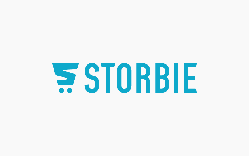
Primary logo
Our primary logo combines our brandmark with the shopping cart glyph. Wherever possible, we aim to use the primary logo in full-color.
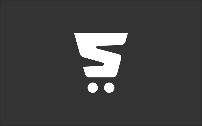
Glyph logo
We should only use the glyph on it's own when there's insufficient space for the full primary logo, or if legibility of the full logo is compromised.
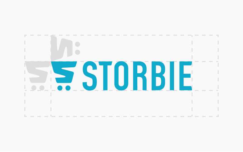
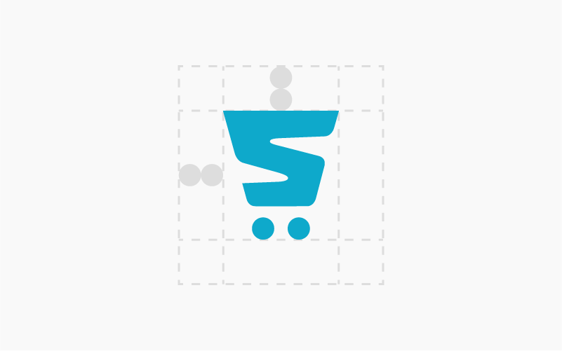
Clear space
Logos work best when they have room to breathe and stand on their own. Components of the logo can be used as a reference to measure the appropriate amount of clear space.
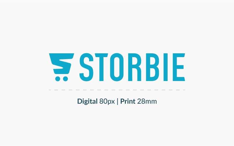
Min size
To maintain the visual integrity of our logo, don’t scale it below 80 pixels or 28 millimeters wide.
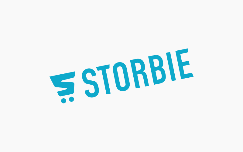
Best practises
Below are some examples of how not to use the Storbie logo.
Primary colours
Storbie blue is our main colour, so it should always be dominant wherever it's applied. Only use the Dark, Supporting and Light tints when you're unable to use the primary colours effectively.